Comparing Metrics Across Views
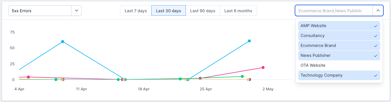
At the top of the dashboard, you’ll see a toggle that allows you to switch on a graph to compare specific metrics across different views.

By default, the last 30 days will be shown on the graph, but you can change this to the last 7 days, last 90 days or last 6 months, using the options in the middle. One thing to note here is that we currently show 30 data points per trend, so when comparing different data sets it’s important to have crawls of similar regularity (i.e. daily or weekly) in the graph.